Poplar Place
Created on independent contract
Category: Brand Identity
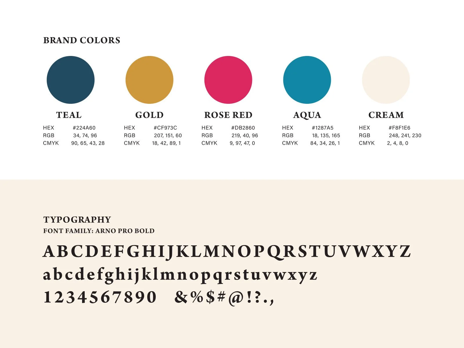
Scope: Logo, brand guidelines
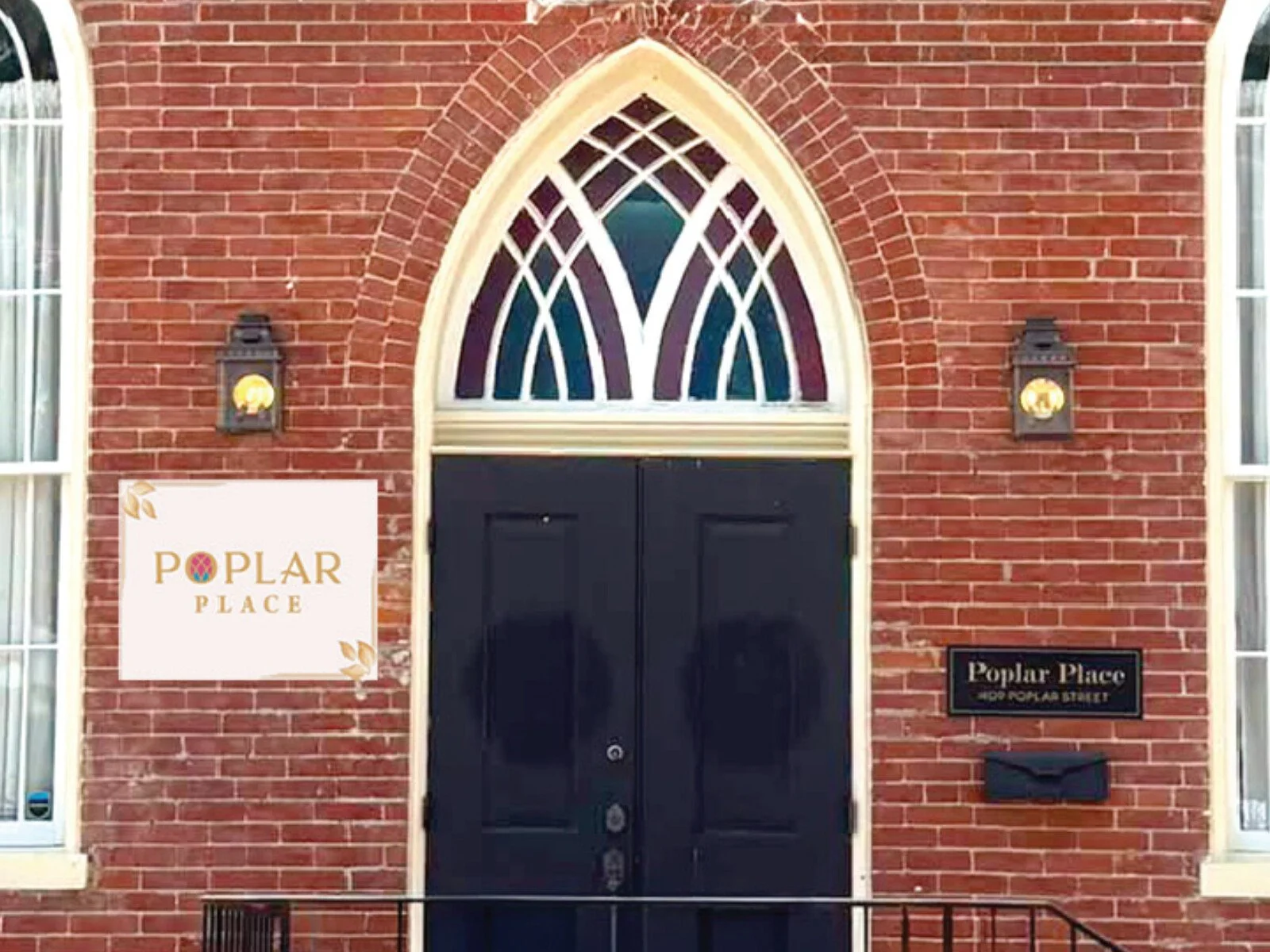
The Ask: Poplar Place is a 19th-century church converted into a wedding venue. The owners needed a mark that read timeless and elegant without feeling dated, while nodding to the building's history.
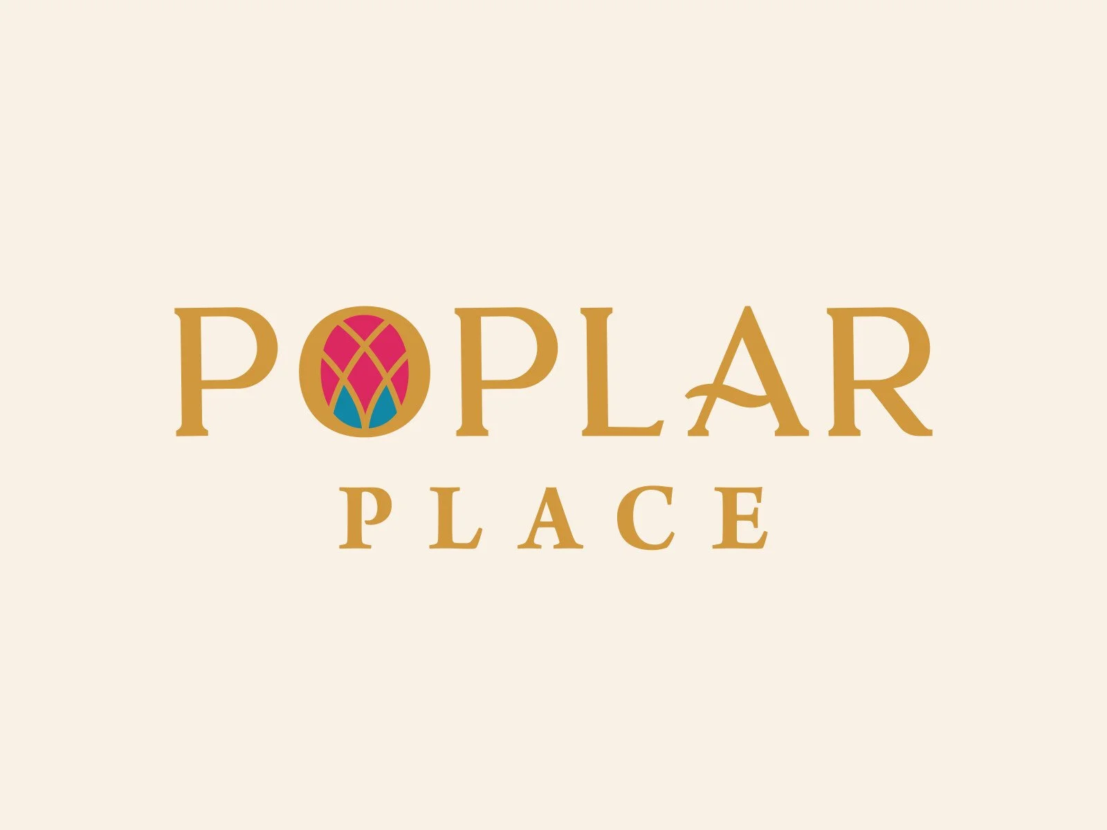
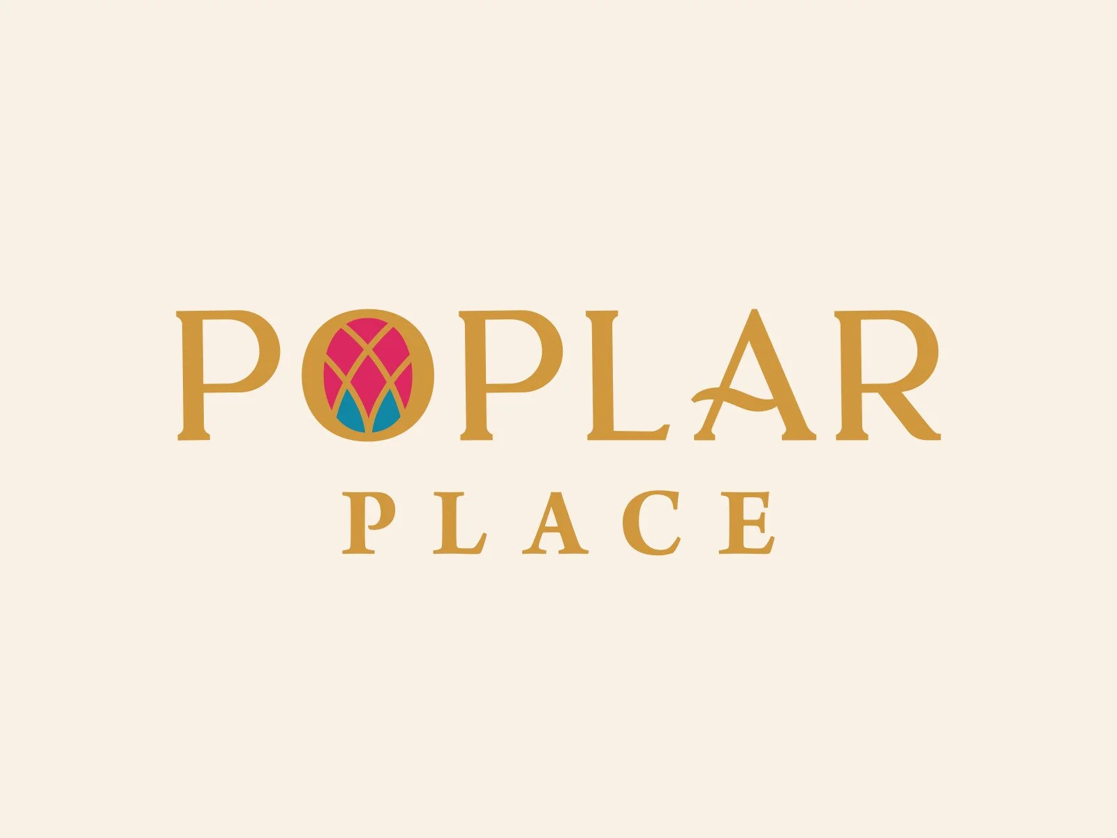
The stained glass window is represented in the O, tying the mark directly to the venue's original architecture.
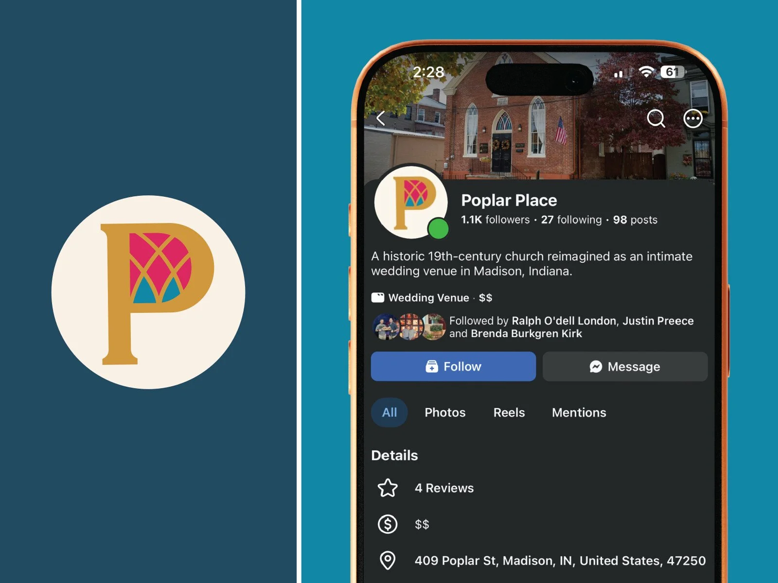
The Results: Primary Logo with alternative social media icon. Built to hold up on a variety of scales including stationery, signage and digital.